In this tutorial, we will explore various ways to implement a Checkbox in Flutter. A Checkbox is a type of widget that holds a boolean value. The two widgets that we will cover in this tutorial are:
- Checkbox
- CheckboxListTile
If you are interested in Flutter video tutorials, check this playlist: Flutter Video Tutorials. Also, there is a large collection of code examples if you check Flutter tutorials page.
If you are interested in video tutorials, check out the Flutter Video Tutorials page.
Checkbox
In the code example below, we have used the Checkbox widget as a child of the Row widget. The reason for this is that the Checkbox widget cannot be a parent widget. If you want to display some identification of the field, such as text, you will need to place the Checkbox inside a Row and add the required identification, as shown in the example below:
child: Row(
  children: [
    Checkbox(
      value: _checkbox,
      onChanged: (value) {
        setState(() {
          _checkbox = true;
        });
      },
    ),
    Text('I am true now'),
  ],
),
As shown in the code snippet above, we have defined a boolean variable called _checkbox. Initially, its value is set to false. Once the user presses the Checkbox UI element in the app, it sets the state of the boolean to true. In this case, once the value of the checkbox is set to true, it cannot be changed back to false as the state has been set.
If your app requires the Checkbox to be flexible and toggle between “true” and “false”, you can set it up in a way that every time the checkbox is pressed, the value changes to the opposite value, as shown in the example below:
child: Row(
  children: [
    Checkbox(
      value: _checkbox,
      onChanged: (value) {
        setState(() {
          _checkbox = !_checkbox;
        });
      },
    ),
    Text('I am true now'),
  ],
),
Next, let’s discuss CheckboxListTile.
CheckboxListTile
The difference between the two widgets is that the CheckboxListTile has a property called “title”, which means you don’t need additional widgets to give your checkbox some sort of identification. In the example below, you will see how to implement the same Checkbox as before, but this time using a CheckboxListTile widget:
child: CheckboxListTile(
  controlAffinity: ListTileControlAffinity.leading,
  title: Text('I am true'),
  value: _checkbox,
  onChanged: (value) {
    setState(() {
      _checkbox = !_checkbox;
    });
  },
),
Perhaps you have noticed that this way of implementing a Checkbox requires less code. The CheckboxListTile has a property called “controlAffinity,” which by default is set to “ListTileControlAffinity.trailing,” meaning the checkbox will be on the right side of the title. In the example above, we used “ListTileControlAffinity.leading” to replicate the previous Checkbox. You can visualize and test both of these widgets using the code example below:
import 'package:flutter/material.dart';

void main() {
  runApp(const MyApp());
}

class MyApp extends StatelessWidget {
  const MyApp({super.key});

  @override
  Widget build(BuildContext context) {
    return MaterialApp(
      title: 'Create a Checkbox',
      theme: ThemeData(
        primarySwatch: Colors.blue,
      ),
      home: const MyHomePage(title: 'Create a Checkbox'),
    );
  }
}

class MyHomePage extends StatefulWidget {
  const MyHomePage({Key? key, required this.title}) : super(key: key);
  final String title;
  @override
  _MyHomePageState createState() => _MyHomePageState();
}

class _MyHomePageState extends State<MyHomePage> {
  bool _checkbox = false;
  bool _checkboxListTile = false;
  @override
  Widget build(BuildContext context) {
    return Scaffold(
      appBar: AppBar(
        title: const Text('Create a Checkbox'),
      ),
      body: Center(
        child: Column(
          children: [
            Row(
              children: [
                Checkbox(
                  value: _checkbox,
                  onChanged: (value) {
                    setState(() {
                      _checkbox = !_checkbox;
                    });
                  },
                ),
                Text('I am true now'),
              ],
            ),
            CheckboxListTile(
              controlAffinity: ListTileControlAffinity.leading,
              title: Text('I am true now'),
              value: _checkboxListTile,
              onChanged: (value) {
                setState(() {
                  _checkboxListTile = !_checkboxListTile;
                });
              },
            )
          ],
        ),
      ),
    );
  }
}
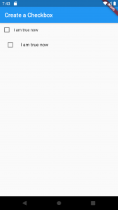
If you run the above code example in your Android studio, you should get an app that looks like the one in the image below.
How do I change the color of a Checkbox?
n Flutter, you can change the color of a Checkbox by using the activeColor and checkColor properties of the Checkbox widget.
The activeColor property is used to change the color of the checkbox when it is checked, while the checkColor property is used to change the color of the checkmark inside the checkbox. Here’s an example of how to use these properties:
Checkbox(
  value: true,
  onChanged: (newValue) {
    // Do something
  },
  activeColor: Colors.blue, // Change the color of the checkbox when it is checked
  checkColor: Colors.white, // Change the color of the checkmark inside the checkbox
),
In the above example, the activeColor property is set to Colors.blue, which changes the color of the checkbox when it is checked to blue. Similarly, the checkColor property is set to Colors.white, which changes the color of the checkmark inside the checkbox to white.
You can replace the color values with any other color of your choice to change the color of the Checkbox.
Conclusion
I hope this Flutter tutorial is helpful to you. If you are interested in learning Flutter, please check other Flutter tutorials on this site. Some of them have video tutorials included.
Happy learning!