The BottomNavigationBar is a built-in widget in Flutter that is being widely used in many different mobile apps. It is used to create a bottom navigation bar feature in your mobile app to help users navigate between different app pages.
The bottom navigation bar in Flutter can contain multiple items such as text labels, icons, or both. It allows the user to navigate between the top-level views of an app quickly. In Flutter applications, we usually set the bottom navigation bar in conjunction with the Scaffold widget. The Scaffold widget has a property called bottomNavigationBar that allows us to set an object of BottomNavigationBar. Although simply setting the BottomNavigationBar widget in Scaffold will make it work as a navigation bar. We will still need to create BottomNavigationBarItem(s) and configure each item. In this tutorial, you will learn how to do it all.
There are a few things you have to remember before using BottomNavigationBar in your app,
- Your BottomNavigationBarItems is limited to 5(minimum of 2),
- If you have less than two items you will get an error,
- You have to set an icon and a label property and you need to have corresponding widgets for them
Below is a basic code example that creates a BottomNavigationBar.
BottomNavigationBar(
          items: const <BottomNavigationBarItem>[
            BottomNavigationBarItem(
                icon: Icon(Icons.home),
                label: 'Home',
                backgroundColor: Colors.teal
            ),
            BottomNavigationBarItem(
                icon: Icon(Icons.person),
                label: 'Profile',
                backgroundColor: Colors.cyan
            ),
            BottomNavigationBarItem(
              icon: Icon(Icons.settings),
              label: 'Settings',
              backgroundColor: Colors.lightBlue,
            ),
          ],
          type: BottomNavigationBarType.shifting,
          currentIndex: _selectedIndex,
          selectedItemColor: Colors.white,
          unselectedItemColor: Colors.grey,
          iconSize: 40,
          onTap: _onItemTap,
          elevation: 5
      ),
Bottom Navigation Bar Properties
When creating a BottomNavigationBar widget there is a list of properties that you can configure. I am listing these properties below with a short description of each.
- items – It defines the list to display within the bottom navigation bar. It uses an argument BottomNavigationBarItem that contains sub-properties. Below is a code example to create a BottomNavigationBarItem.
BottomNavigationBarItem(
    icon: Icon(Icons.home),
    label: 'Home',
    backgroundColor: Colors.teal
),
- currentIndex – It determines the current active bottom navigation bar item on the screen,
- onTap – It is called when we tap one of the items on the bar,
- iconSize – It is used to specify the size of all bottom navigation item icons,
- fixedColor – It is used to set the color of the selected item. If we have not set a color to the icon or title, it will be shown.
- type – It determines the layout and the behavior of a bottom navigation bar.
It behaves in two different ways which are: fixed and shifting. If it is null, then fixed is used. Otherwise, it will use shifting. When shifting is used, the user will see an animation when the button is tapped. In our case, we will use color change as a UI feature of the shifting Bottom Navigation Bar.
Complete Code Example
Below is a complete code example of a very simple Flutter app that uses the BottomNavigationBar widget.
import 'package:flutter/material.dart';

void main() => runApp(MyApp());

/// This Widget is the main application widget.
class MyApp extends StatelessWidget {
  @override
  Widget build(BuildContext context) {
    return MaterialApp(
      home: MyNavigationBar (),
    );
  }
}

class MyNavigationBar extends StatefulWidget {
  MyNavigationBar ({Key key}) : super(key: key);

  @override
  _MyNavigationBarState createState() => _MyNavigationBarState();
}

class _MyNavigationBarState extends State<MyNavigationBar > {
  int _selectedIndex = 0;
  static const List<Widget> _options = <Widget>[
    Text('Home Screen', style: TextStyle(fontSize: 35, fontWeight: FontWeight.bold)),
    Text('Profile Screen', style: TextStyle(fontSize: 35, fontWeight: FontWeight.bold)),
    Text('Settings Screen', style: TextStyle(fontSize: 35, fontWeight: FontWeight.bold)),
  ];

  void _onItemTap(int index) {
    setState(() {
      _selectedIndex = index;
    });
  }

  @override
  Widget build(BuildContext context) {
    return Scaffold(
      appBar: AppBar(
          title: const Text('BottomNavigationBar Example'),
          backgroundColor: Colors.teal
      ),
      body: Center(
        child: _options.elementAt(_selectedIndex),
      ),
      bottomNavigationBar: BottomNavigationBar(
          items: const <BottomNavigationBarItem>[
            BottomNavigationBarItem(
                icon: Icon(Icons.home),
                label: 'Home',
                backgroundColor: Colors.teal
            ),
            BottomNavigationBarItem(
                icon: Icon(Icons.person),
                label: 'Profile',
                backgroundColor: Colors.cyan
            ),
            BottomNavigationBarItem(
              icon: Icon(Icons.settings),
              label: 'Settings',
              backgroundColor: Colors.lightBlue,
            ),
          ],
          type: BottomNavigationBarType.shifting,
          currentIndex: _selectedIndex,
          selectedItemColor: Colors.white,
          unselectedItemColor: Colors.grey,
          iconSize: 40,
          onTap: _onItemTap,
          elevation: 5
      ),
    );
  }
}
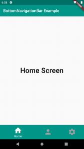
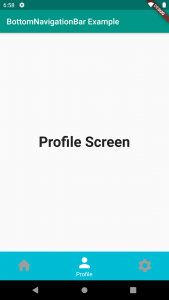
As you can see in the code example above, we have used the BottomNavigationBar widget within a Scaffold widget. This navigation bar contains three BottomNavigationBarItem widgets. Initially, we have set the value of “currentIndex” to 0(zero). When user taps on one of the items on the navigation bar, the onTap function is used to change the value of the selected item’s index. This will make a corresponding mobile app page to display. The widgets we are using here are just simple Text Widgets with some text in them, that we put inside the List<Widget> “_options”. But you can use any widgets your app needs.
If you build and run the above code example, the Flutter app will look and work as illustrated with the images below.
I hope this Flutter tutorial was helpful for you. If you are interested in learning Flutter, please check other Flutter tutorials on this site. Some of them have video tutorials included.
Happy learning!